Let’s walk into the vortex of every entrepreneur’s worst nightmare: an awful user experience. Ever had users not interact with your product the way you expected them to?
Why is that a nightmare? Well, did you know that 90% of data perceived by the human brain is visual? But you have realized that they are as lost as you are when it comes to fixing your designs? Here’s a sidewalk of a poor UX design:
Exhibit A –
The user journey mapping is particularly important in times when these directions may seem deceptively simple, and yet has infinite loopholes.
UX design applies practically to every facet of life as we know it. Ever wondered why we get hooked on certain websites and spend hours without realizing it? That’s where a great UX design comes into play. When it is executed well, it is virtually invisible and seamless but when it’s poorly executed that’s when it hurts the eye!
Want to know how much lack of awareness about user psychology costs you? 90% of users will leave a site solely due to bad UX design and even more so 70% of online businesses fall through because of bad UX.
Get Your FREE UX Design Checklist
A bad UX becomes counterproductive in no time and soon you would have wounded many unintentionally, costing your performance and organic growth.
The journey of psychology and user experience is a way of life! Some sites are easier to navigate whereas the others make you want to leave and never come back.
Exhibit B –

Source – UAT.edu’s screenshot from Web Archive
The reasons behind the downfall of these UX designs could be many:
- Classic Form-Over-Function example: The designer focused more on intricate designs rather than simplicity or usability.
- Prioritizing one’s assumption over User Research: Including various pop-ups and other intrusive features to prompt a user to carry out a particular action.
- Failing to understand basic principles of psychology in UX design.
One of the grave blunders that any rookie designer would make is not understanding UI/UX psychology. The ignorance towards psychological principles and theories has led tech giants to also commit hideous oversights who should know better.
What is Design Psychology?
Here’s a quick question: what if you could predict human behavior by understanding how users understand and their mental models that process information.
If you could get into the psychology of your users and influence your customers’ experience, that would make all the difference!
What does it require you to do? You need to design your ideal users in your mind and cast aside your assumptions by stepping into the user’s shoes.
How do you do that? Observe your target users to pinpoint their motivations behind their actions, and that will give you a roadmap of touchpoints of the customer journey route to help you create a seamless user experience design.
Customers are driven by their emotions when they look at the website and scour through your product or services. They establish a connection with the brand based on what they see and this determines whether they complete the purchase or not.
Great design principles advocate leveraging principles of cognitive psychology in UX design to help you create effective and pleasurable experiences. Here are 8 UX Psychology Principles that every designer and every entrepreneur must know.
Download Your FREE UX Design Checklist
1. Hick’s Law
Have you ever walked into a showroom and felt overwhelmed by the infinite number of choices? Couldn’t make up your mind as to what you should purchase? Pushed into a bigger dilemma in a circus of way too many lucrative options?
Hick–Hyman’s law describes the time it takes for a user to decide while they are considering the number of options that they have. The more options to pick from, the longer one takes to select.
This leads to an increase in the rate of the gain of information (the amount of time taken to process a certain amount of information) to reach a decision logarithmically.
This law aims to assess cognitive information as per the capacity in the choice of their reaction experiments.
A classic example of cognitive overload is that of a TV remote, with just one click, you have a great many options and that can be a frustratingly overwhelming experience when it comes to making up your mind.
To provide a better user experience, provide a few crystal clear options that are minimalist but straightforward about their features.
But if you have to display all of the options, style them in a way that is easily digestible bits and prioritize recommended options. This is particularly helpful while creating options.
2. Jakob’s Law
Imagine going to a supermarket and finding the interior structure is confusing. Instead of straight alleys with compartmentalized sections, it’s a complex zig-zag, and you are redirected to different alleys to finally get to the section you want.
From a design perspective, it might be very innovative but from usability and user testing, it falls through since users get lost in the process! And you wouldn’t want to increase your bounce rate even though you are tempted to design a novel interface.
Jakob Nielsen states that users favor familiar experiences and prefer those sites that are similar to those sites that they have spent time on before. It would take less time for them to navigate and understand since they know how it works and feels familiar.
The best takeaway from this law is that you can make your website more oriented toward popular and well-to-do sites. Study them, conduct a competitor analysis, identify popular structures and make your designs competitive.
3. Miller’s Law
Now imagine that you land on the page wherein you need to remember too many things at a time and that overloading of information will differently knock you out and bounce off.
Remember LESS in MORE!
Miller’s Law states that in our immediate working memory known as the short-term memory, we can keep around only seven items. Anything that crosses that threshold is out of the mind real quick!
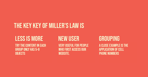
To help in reducing the cognitive load, you can try breaking them down into smaller chunks to present a large set of data in easily digested bites. The idea is to be easy on the eyes and effective on the minds!
Do you want to try out what chunking is? Pick up a random phone number, divide it into buckets and then associate that bucket to any color or famous event associated with that number. Let’s see if you remember.
4. Gestalt Principles
You may be chaotic and you may tend to leave behind a mess but an unnecessary clutter that simply takes up space in your mind as well as your eyes like a freeloader.
Gestalt principles state that our minds tend to group and organize elements in a rather more predictable manner. The five Gestalt Principles are:
- Proximity
- Similarity
- Continuity
- Closure
- Connectedness
These psychological principles and theories help in streamlining the design process as we tend to group related content and organize it based on these 5 principles visually.
Key take-away: Style up different elements like your title, figures, and avatars or patterns in a similar fashion so that they are perceived as a group.
Get Your FREE UX Design Checklist
5. Color Psychology
It’s late in the night, you are tired, you were surfing on the internet and you landed on a page that has way too many clashing and tacking colors that hurt your eyes. Sounds like an experience you have encountered before.
Colors that are endearing influences perception and evoke an emotion. Did you know colors are associated with evoking emotions?
Colors elicit unique responses in your customers! A savvy web designer should be even more well-versed with the effect of each color and how one can leverage its use and when to put it in use.
Perception and feelings are influenced by colors and being a UX designer, you need to bank on this! Select the apt colors for a brand, UI, or product, and be mindful of the feeling you want to evoke.
For example, the green color is associated with being good, natural, and stable. However, it might not be the best fit for food as such. From elite wine testing to color testing, your user-testing is going to help you understand what works for you!
6. Mental Models
All of our interactions with the world are guided by the cues of our past experiences that are organized as cognitive representations known as mental models. When you click on a website, do you expect it to function or operate when you scan the navigation at the top of the webpage?
A mental model describes what a user thinks they know about how to use a website, mobile app, or other digital product. They are shaped by our past experiences rather than logical facts. Aligning UX designs with different mental models helps them create products that are easier to use.
Designing with the “real world” in mind helps in providing users’ expectations right.
A great example of these mental models is gestures. All of the UI/UX design psychology incorporates swipes, pinches, and taps that are designed to mimic actions and motions that are used in real life to accomplish similar goals.
Aligning psychology in user design with how we do things every day can help us design around these mental models to help us quickly understand how their components behave.
7. The Von Restorff Effect – The heart of UX Psychology
The Von Restorff Effect states that when we see a group of similar objects, the one that stands out and differs the most.
This principle makes all the difference when you want to help users remember important details such as pin-code, coupon-code, seat number, etc. Making them visually distinctive might just do the trick.
Also known as The Isolation Effect, this law helps in predicting that the distinct objects would grab one’s attention enough to be memorable when they are surrounded by other similar objects because they stand out from the rest.
Designers often use this principle to improve UI usability by prompting call-to-actions that compels one to take an action. This is also in studying memory processes by manipulating the degree of similarity between two objects as well as observers’ performance by discriminating them. Its wordmark is known as the “Von Restorff Effect” owing to its popularity in design.
Want to know whether this actually makes a difference? Have you ever highlighted your textbooks to remember important information? Well, there you have it.
Associating information with additional cues like color helps your brain retain information, or highlighters may go out of business.
8. Fitts’s Law
Fitts law user interface design states that in the context of UX designs the time it takes us to ‘hit’ on a target depends on its size and how close the target is to us.
The size and distance are two key factors considered in the user interface (UI) design psychology of Fitts law. Whichever input field and button performs an action such as ‘Register Now’, ‘Submit’, etc. has larger elements so that they are easier to spot.
Being larger in size, they are easier to interact with so that they are positioned in a region that will be more likely to be hit by the user’s thumbs.
Get Your FREE UX Design Checklist
Over to You!
Understanding how users behave online is an impetus for you to implement the best designs that make users stay hooked to your website for longer. How to improve user experience and design to make it more user-friendly & fetching.
We extensively study the UI/UX psychology design principles that are rooted in psychology to help you augment your user experience to greater heights.
With our renowned years, if you want to create the best designs that follow the psychological make-up of your users’ minds, view our designs on Dribbble or get in touch with us to understand how we can collaborate to develop your app.


